About Auravik

Luxury wellness rooted in purity, calm, and sensory detail.

Auravik is built around the idea that essential oils should feel as refined digitally as they do in hand. The brand direction combines spa elegance, clear benefits, product trust, and a more premium customer experience.

Pure ingredients Product storytelling centered on authenticity and benefit-led use.
Luxury presentation Warm editorial imagery, elevated typography, and clean layouts.
Wellness first Aromatherapy, skincare, massage, diffuser, and ritual-driven positioning.
Global intent Ready for both direct customers and broader supply conversations.
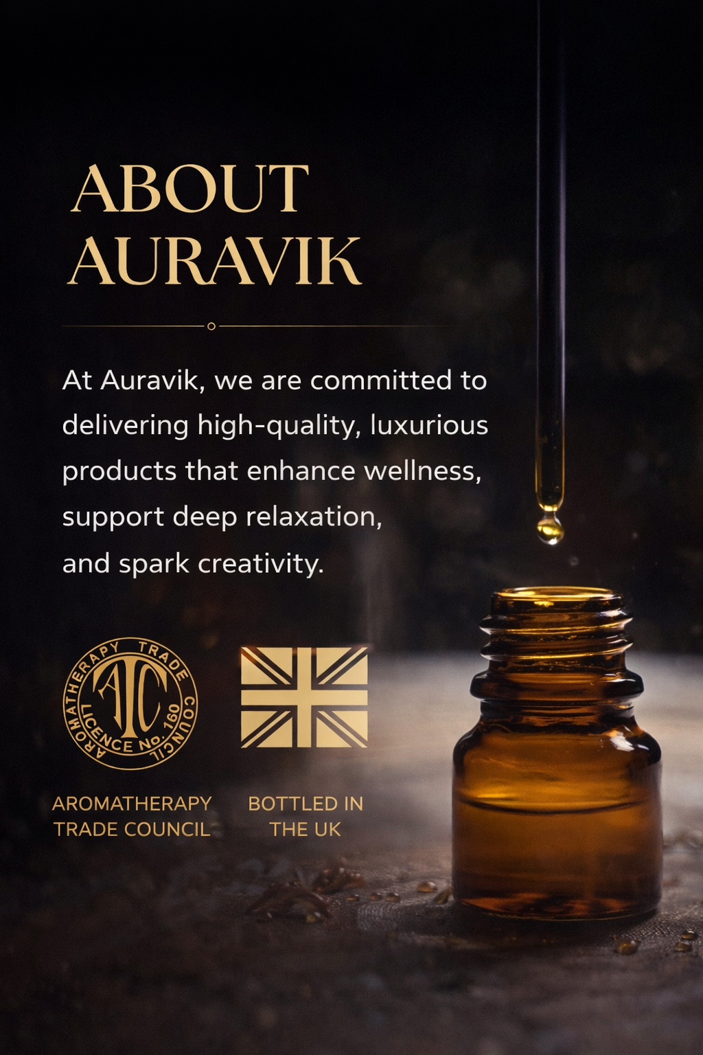
Dark luxury Auravik about campaign image with bottle and golden dropper
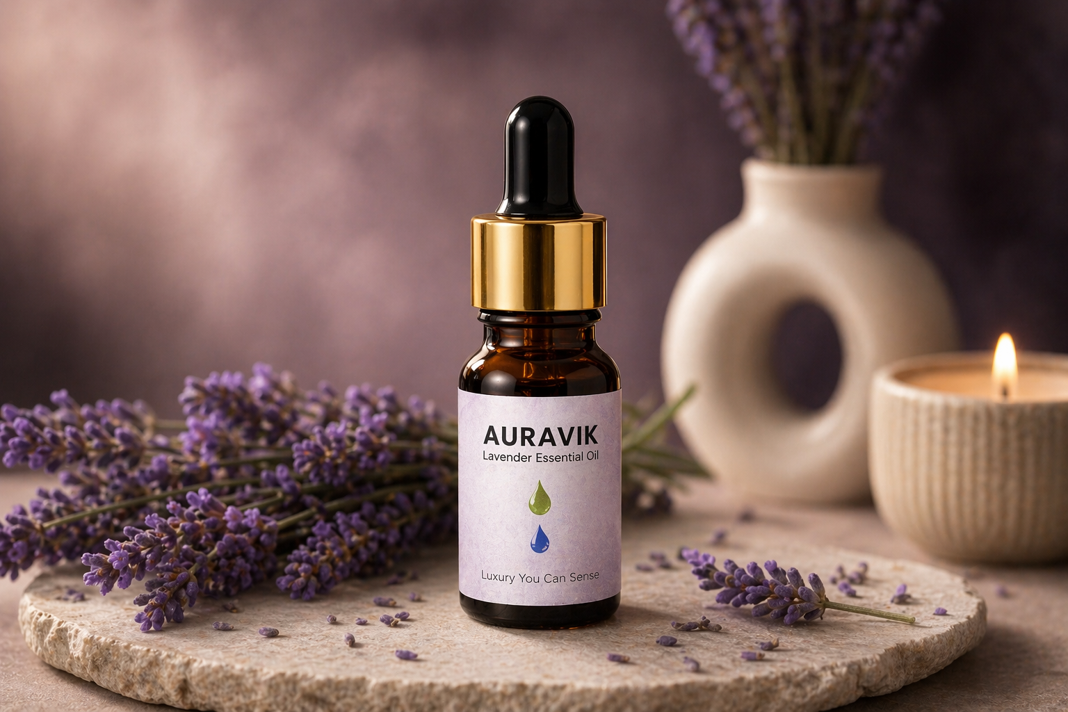
Auravik lavender bottle on a soft premium lavender setup

What The Brand Should Communicate

Not just oil. A complete premium ritual.

Your reference visuals make it clear that Auravik should sit closer to a boutique wellness house than a plain commodity listing. The website now follows that same logic with softer luxury color, deeper atmosphere, and product-first design.

Better emotional positioning Customers can feel calm, luxury, care, and trust before reading the details.
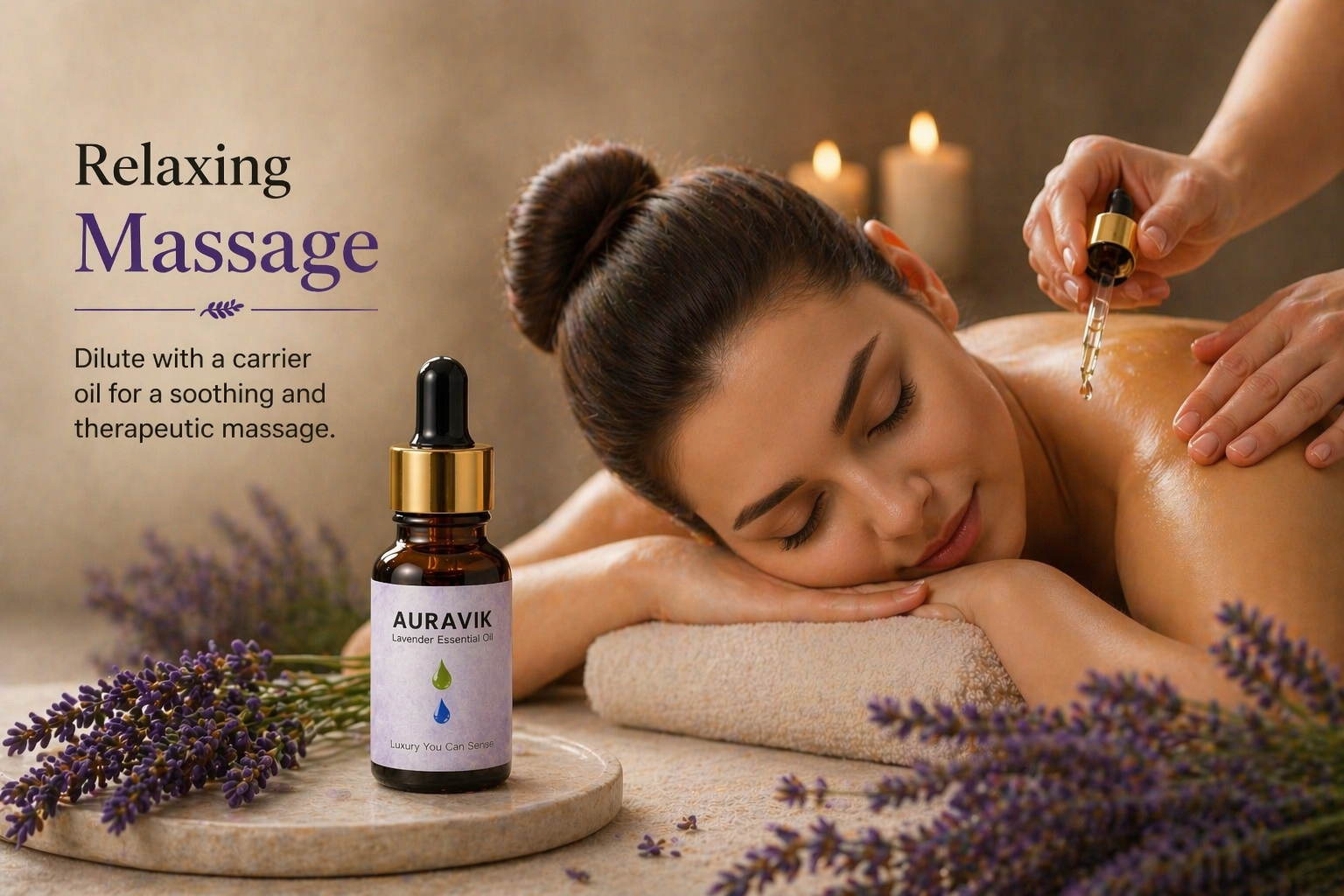
Stronger product context Use-case visuals help oils feel usable, desirable, and giftable.
Clearer story across pages About, product, export, and contact pages now all point to the same premium identity.

Bottled in the UK

Auravik can also tell a cleaner cross-border quality story.

The UK bottling visual gives the brand a stronger premium trade narrative, especially for export credibility, cruelty-free positioning, and cleaner quality cues.

UK bottling identity Useful for trust, export conversations, and an elevated international profile.
Cruelty-free and vegan-friendly cues Helps move the brand closer to modern wellness and conscious beauty buyers.
Premium production atmosphere The darker amber-bottle imagery adds craft and seriousness to the brand.
Auravik peppermint origin and sourcing visual showing India and England